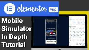
Tutorial On How To Use The Mobile Simulator Extension
Tutorial On How To Use The Mobile Simulator Extension
Hi guys, in this Tutorial I’m going to be showing you what else you can do with the mobile simulator extension, so sit back, relax, hit that like and subscribe button, and let’s get into the Tutorial.
Hi guys, if you missed last week’s Tutorial, you’d have seen that I showed you around the mobile simulator extension. This free to use extension lets you test your mobile responsiveness of your website and shows you what your website will look like on the most popular devices. If you want to see last week’s Tutorial and see how to use the extension, then stick around to the end of the post. Remember that everything I show you in this Tutorial is completely free. There is a paid version for the newest devices, but that’s up to you if you want to sign up, and there’s no affiliate links.
Opening and Configuring the Mobile Simulator
So what you’re first going to need to do is open the extension. Just a quick recap on last week’s video: the green button in the top right-hand-side lets you change the skin of the devices, meaning if you want to view the website on a different phone device, this is where you change it. So this is obviously a Samsung.
If I want to change that to an iPhone, I can do that within this menu, or I can just change the model of the Samsung. And the good thing is for us web designers, if we’re in a preview window, we can still use the extension, so instead of our web page builder guessing what size phone we’re using, we can accurately test it straight away within the page builder’s preview window.
Accessing Features and Mock-Ups
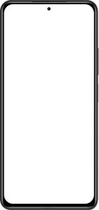
So what else can we do within the extension? If we click on the button on the right-hand-side underneath the green one, we can go to features and mock-ups. We’ll select features first, and this will take us over to the website webmobilefirst.com. From here, you can get handy CSS and JavaScript which lets you target specific iPhones. If we scroll down, we can get a free download of the mock-up of the phone.
Changing Device Orientation
This is the one we are using in the extension at the moment. Don’t worry, I will show you later in the video how to download all the other mobile devices, but for now, we’re going to go back to our simulated website, and this time we’re going to change the orientation of the phone, and we do that by clicking on the button on the right-hand-side, and as you can see, our page is fully responsive, and we can use it as we would a normal mobile phone.
Taking Screenshots with the Mobile Simulator
If you want to take a screenshot of our simulated page, we can do that by clicking on the camera icon on the right-hand-side. In here, we can include or exclude the frame of the mobile phone. We also have the option to take a full window screenshot. If you want to make a screen recording, we can do that on the right-hand-side by just clicking the video camera button. This is great if you want to send your clients demo videos of their website on mobile phones.
Recording and Sharing Videos
The really good thing here is when you have finished recording your video and you click the stop button, you can automatically download the video or you can send it to someone else. You will also see a preview of the video you’ve recorded. If we want to change our screen from dark mode to light mode or light mode to dark mode, we can do that on the right-hand-side by clicking on the activate button. Underneath that is a share button which makes it easier for you to send this site to someone else.
Exploring Help and Settings Options
Underneath the share button, we have a help centre, and if you’ve got any issues with the extension, you can send them to the developers. And finally, at the bottom, we’ve got our settings. We can do things like hiding the address bar on keyboard, change our background colour, and choose our default mobile device. But when we load the extension, now what I’m going to do is show you something I said I was going to show you earlier in the video, and that was how to download all the images for the devices.
Downloading Mobile Device Mock-Ups
To do that, we need to go back to the right-hand-side of our extension and click on features and mock-up, and this time we’re going to click on mock-up, and as you’ll see, we get taken back over to the website, and I did show you earlier how you can download this image of the mobile phone, and if we scroll down just past this, we can see there’s a button that says browse the other mock-ups.
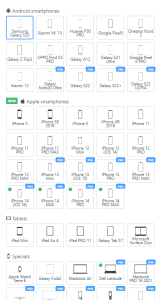
Accessing Additional Mock-Ups
If we give this a click, we’ll be taken to a page that has all the images of the mock-ups we can download for free. Just click on the one you want to download and click on the download button. If you have found this video useful, please do hit that like and subscribe button, and if you want to see how to install the extension, then click on the Tutorial here.
Now that’s it for this Tutorial.
Thanks for watching and I will see you in the next one.