Accurately Check You Websites Mobile responsiveness For Free With Mobile Simulator
Accurately Check You Websites Mobile responsiveness For Free With Mobile Simulator
Hi guys! In this tutorial, I’m going to show you how to accurately check your website’s mobile responsiveness with a simple, free extension. So sit back, relax, hit that like and subscribe button, and let’s get into the tutorial.
The first thing we need to do is visit webmobilefirst.com. This is where you can find the mobile phone simulator extension. You can find this link at the top of the description. As soon as the page loads, you can see a demo of the simulator. It has the screen sizes for all of the newest mobile phones and some of the oldest. This is a great site to use for mobile phone screen captures and to test your website’s responsiveness.
Installing the Chrome Extension
To add this to our Chrome browser, all we need to do is click on the “Install the Chrome Extension” button. You’ll then be taken to the Chrome Web Store, where you need to click on the “Add to Chrome” button in the top right-hand side and click on “Add Extension” in the pop-up window. It will take a second to install on your Chrome browser, and once it has, it’s been added to the extension tab.
Testing Your Website’s Responsiveness
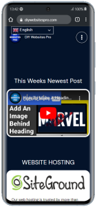
Now, all you need to do is go to the website that you want to check for its responsiveness. For example, I’m going to go into my search bar and type in “DIY Website Pro.” Once my page loads, to check its responsiveness, all we need to do is click on the extensions tab in the top right-hand side and click on Mobile Simulator. This will reload our website into a mobile phone browser, and if we hover over our page, we can scroll down and use it as a normal mobile phone browser.
Changing Devices in the Simulator
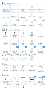
To change the mobile phone we’re simulating, all we need to do is click on the “Change Device” button on the right-hand side. As you can see, there are loads you can choose from. Most of the devices are free to use, but there are some premium ones, which are the newer models. Just select which phone you want to display your website on.
Exploring Pro Plan Features
If you do want to sign up for a Pro Plan, all you need to do is select one of the pro devices, and you can select the “Subscribe” button. You can pay monthly or annually; you do get a slight discount if you pay annually, but you do have to pay the full amount on subscription. You can pay for up to 20 accounts on the same license. This is a really simple and straightforward extension to use to check your website’s mobile responsiveness. You can even check it on Apple Watches.
Remember, most of these features are free to use. You can find the link to the website in the description below. If you have any questions, feel free to drop them in the comments box below or come and find me on my website. If you have found this video useful, please do hit that like and subscribe button.
thanks for watching and I’ll see you in the next one